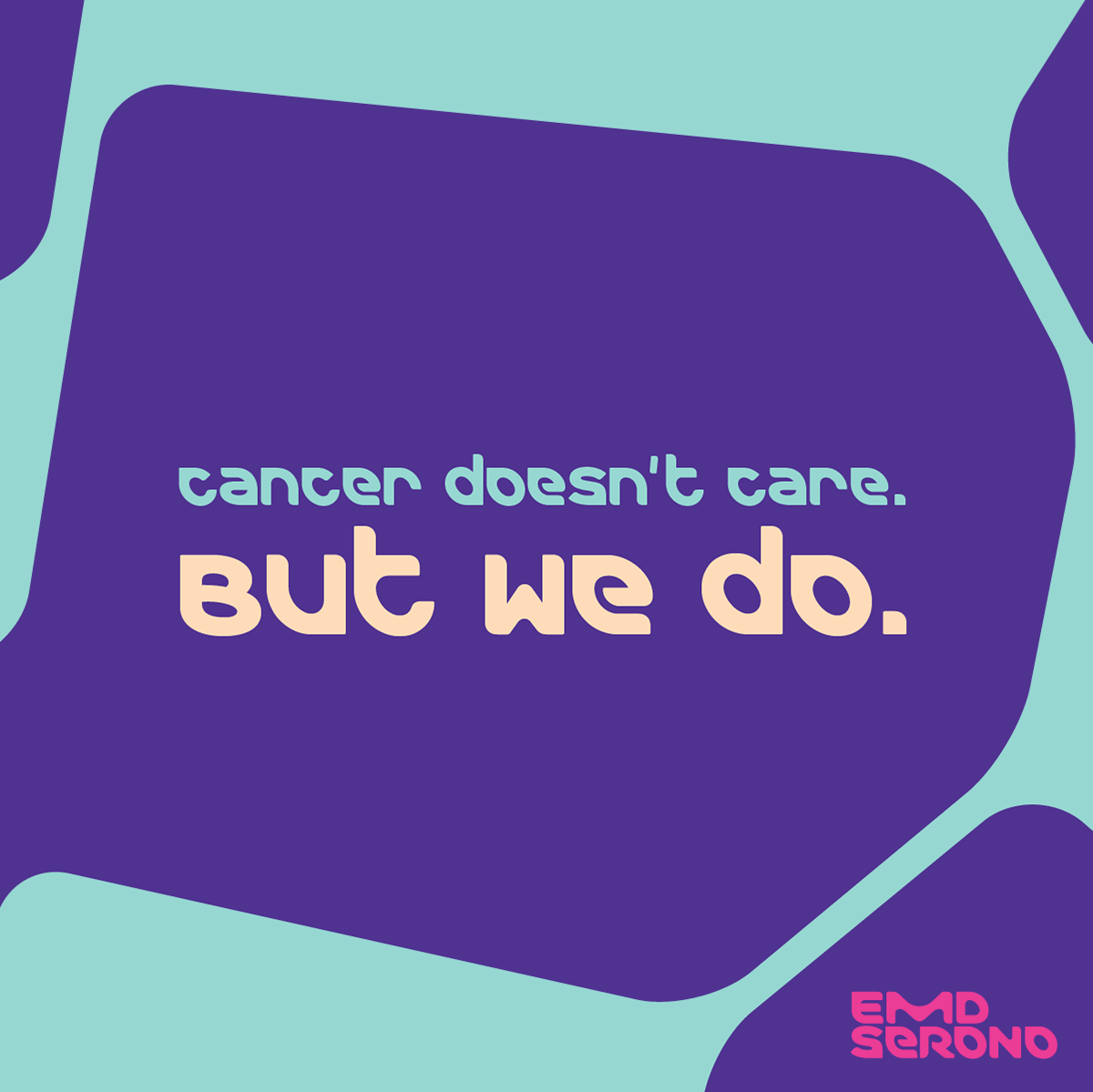
EMD Serono is a specialty innovator that helps create, improve and prolong lives for people living with infertility, multiple sclerosis and cancer. They develop and deliver meaningful therapies, and work to truly understand and respond to the therapeutic needs of individual patients. As Senior Art Director with Real Chemistry, I worked with the brand's set of bright and bold guidelines to create compelling pieces of animated and static social content.

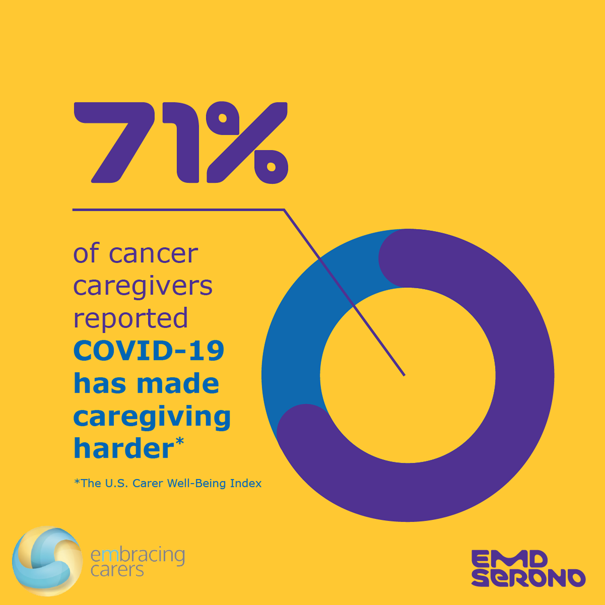
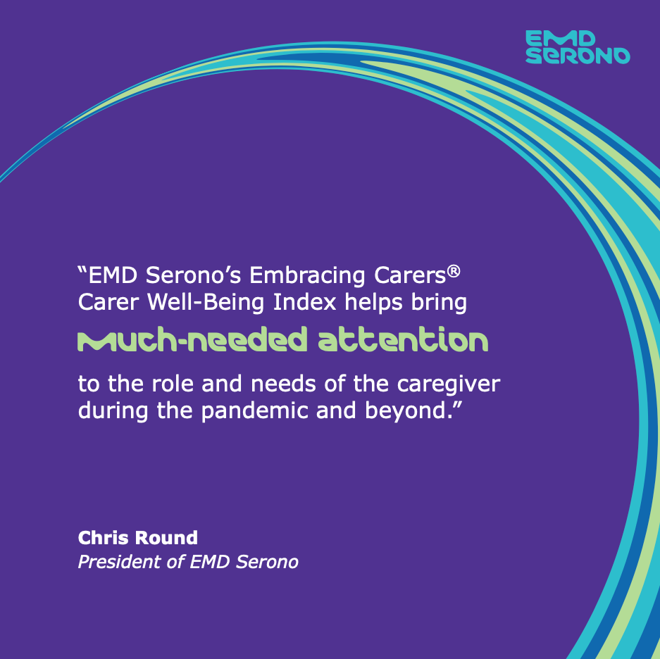
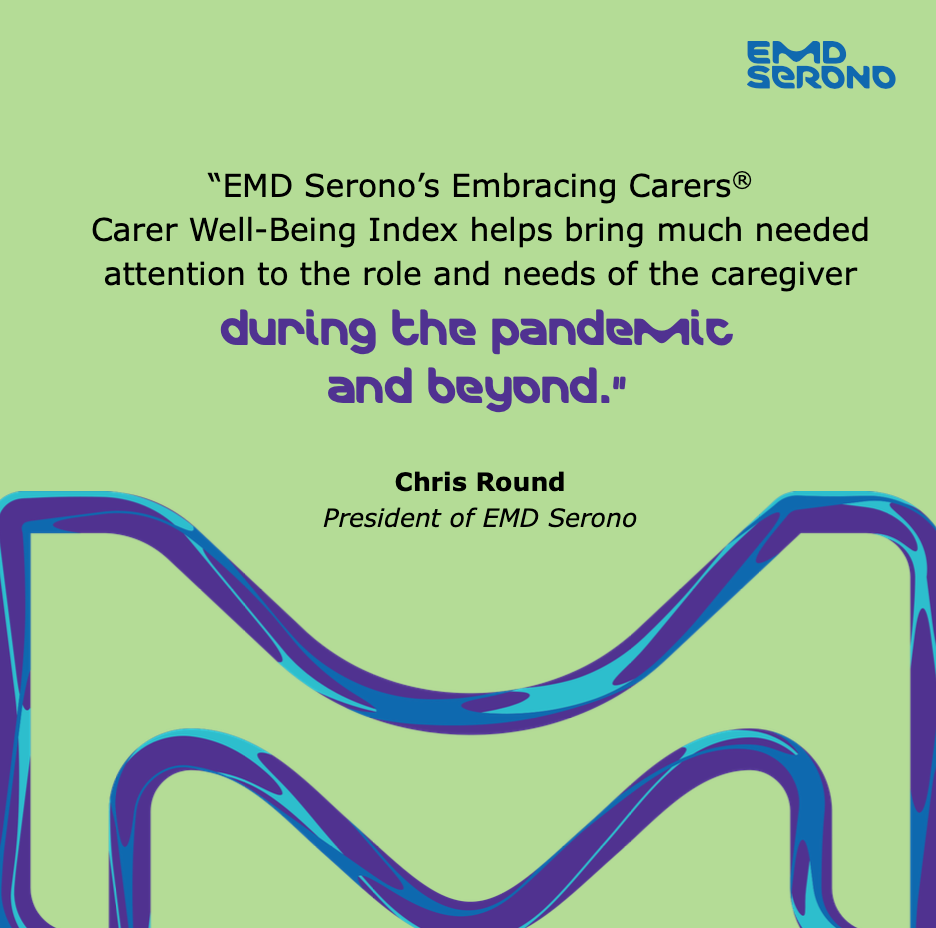
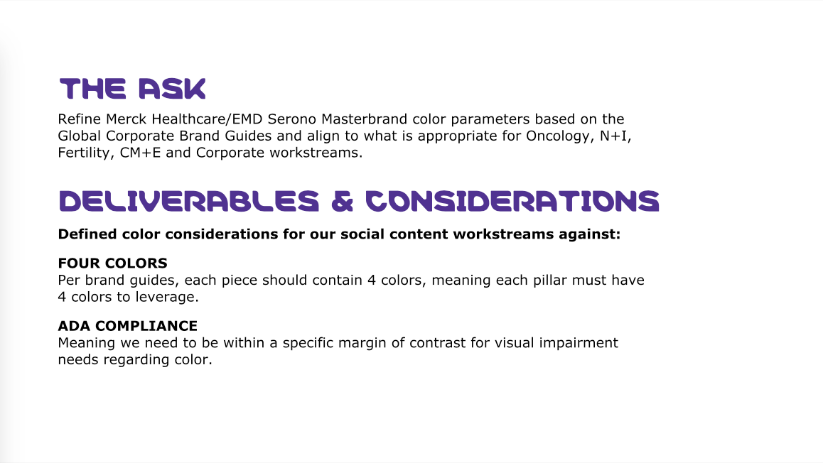
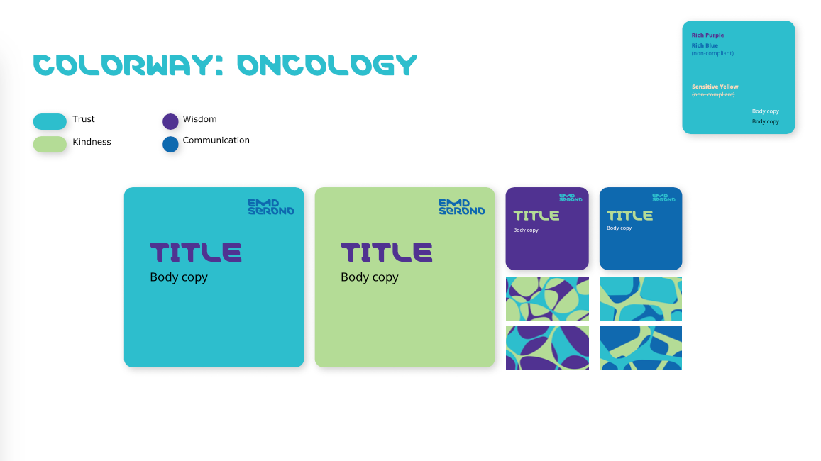
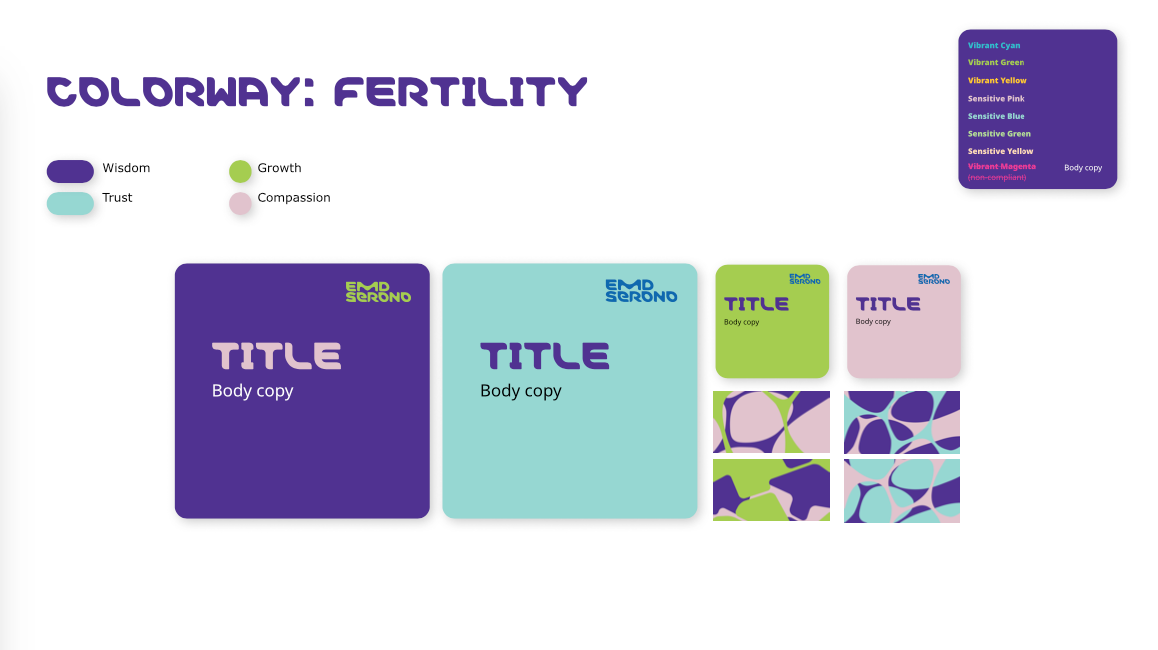
My team ran into challenges with the bright colors sometimes clashing and not feeling cohesive on EMD Serono's social feeds. As a solution, we created a robust set of color guidelines for the brand to help streamline the use of color combinations across the company's therapeutic areas. I leveraged color psychology for rationale behind the choices I made with the brand's palette of vivid, dynamic colors and lighter sensitive tones.
We worked carefully within ADA guidelines and ran all colors through a color contrast analyzer to ensure legibility. Below are some of the pages from our color guide deliverable:
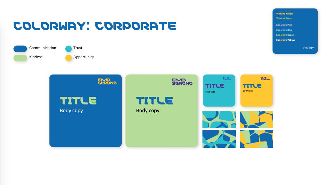
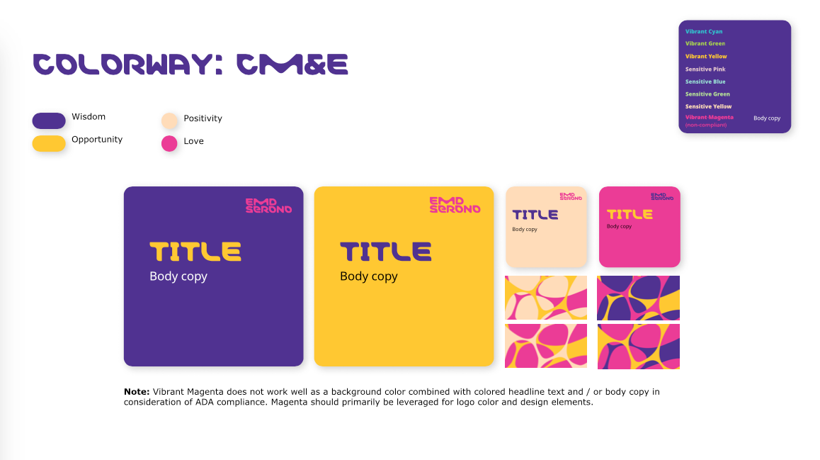
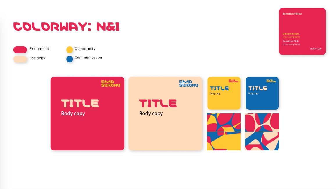
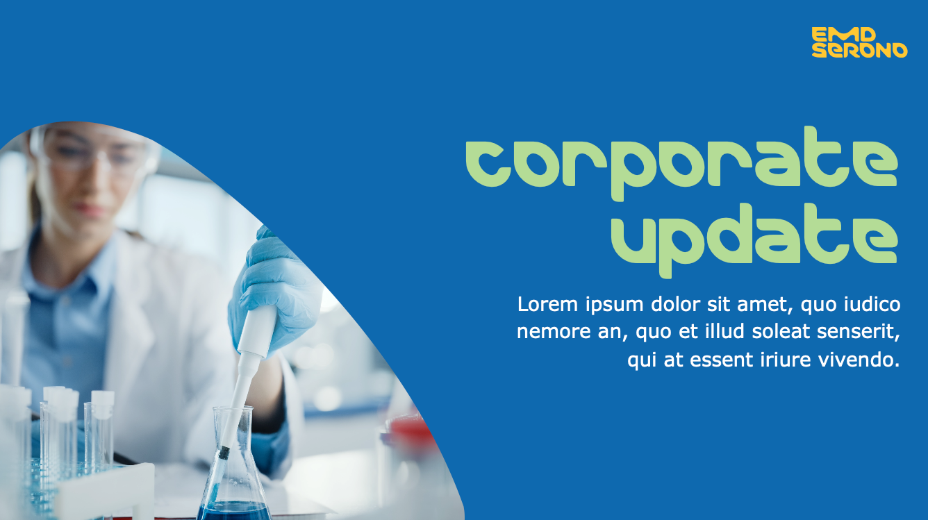
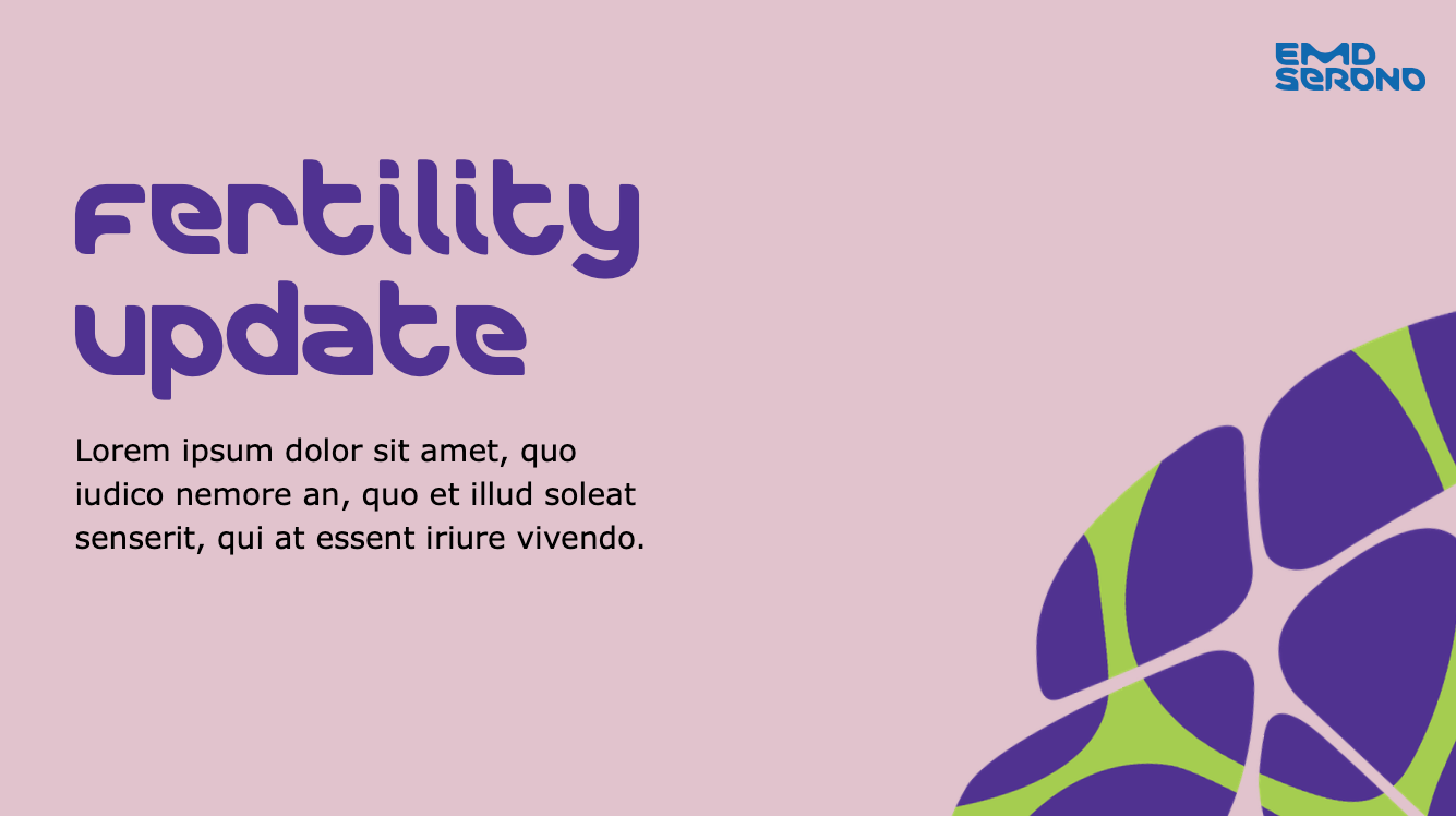
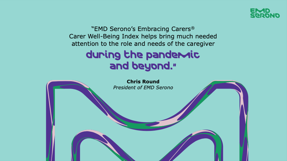
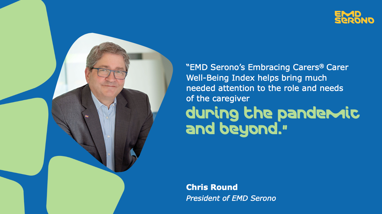
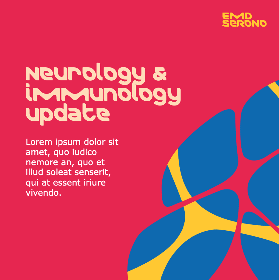
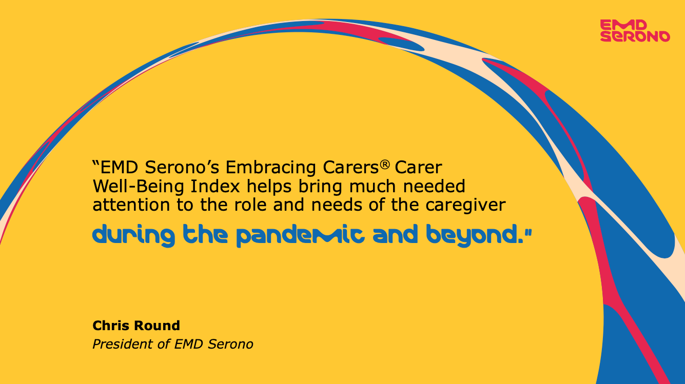
With the new set of color guidelines in place, I developed a set of user-friendly editable static templates as requested by the clients. These were built in Powerpoint and allowed them to easily plug in text and images.